Organizational charts are essential tools for visualizing the structure of a company, showcasing relationships between employees, and clarifying reporting hierarchies. Google Sheets offers a simple yet powerful way to create these charts, leveraging its integration with other Google Workspace tools and its user-friendly interface. In this article, we will walk you through the steps to create dynamic organizational charts with Google Sheets, customize them, and keep them updated.
Table of Contents
Video Tutorial
If you’d prefer written instructions with additional tips, just keep reading.
Why use Google Sheets?
- Free to use
- Skip the Fuss: Ditch complex software and leverage Google Sheets’ familiar interface. Simply input your data, and the chart builds itself, minimizing errors and saving time.
- Effortless Updates: Organizational structures are ever-changing. With Google Sheets, updates to employee information automatically reflect in the chart, keeping it constantly current.
- Data-Driven Accuracy: Focus on entering accurate data. Google Sheets handles the visualization, ensuring a reliable representation of your team structure.
Step-by-Step Guide to Creating an Organizational Charts with Google Sheets
Step 01: Prepare your data
Start by organizing your data in a Google Sheet. For this, we are going to create a table with two columns.
- Insert the names or positions of all employees in the organization in the first column.
- Insert the employee’s respective manager in the second column.
See the following example table for better understanding.

Step 02: Insert the Organizational Chart
Once you prepare the employee table as explained above you are ready to insert the chart.
Once you prepare the employee table as explained above, you are ready to insert the chart.
- Select the entire table including the headers
- Go to Insert.
- Select Charts, this inserts a blank chart in your sheet.

- In the Chart editor sidebar (double-click the chart area if you have already closed the sidebar) click the Chart type dropdown.
- Then select the Organizational chart located at the bottom.

- Also, select the Use row 1 as headers checkbox (Assume that you have selected the column header as I explained above) in the chart editor sidebar.

- The above steps will add a well-arranged organizational chart to the empty chart. You can update the chart by changing the data table in your Google Sheet.
Step 03: Customize Your Chart
The Google Sheets also provide a few customization options for your chart such as box color and box size of your chart. To do that,
- Double-click on the chart area to open the Chart editor sidebar.
- Go to Customize
- From the size dropdown box choose the appropriate box size (small, medium, or large).
- Chose the Node color and the Selected node color (selected node color is the color of the box when clicked on that)

If you need further customization, you can download the chart as an SVG as explained below, and use open-source tools like Inkscape to modify it.
Add employee names as Tooltips to the nodes
If you have created the organizational chart with the employees’ positions, you can add their names as tooltips or vice versa. This way, when you hover over a node in the chart, the name or position of the relevant employee will appear.
To do that, you need to add the employee names in the third column and update the chart range accordingly.

To add the tooltips;
- Double-click on the chart to activate the Chart editor sidebar.
- Change the Data range to include the name column (in our example, A1:B20 should change to A1:C20).
- After updating the data range, the new column will be listed in the Tooltip dropdown. Select the new column for the Tooltip dropdown list.
After completing these steps, select the chart and hover over each node to see the employee names as tooltips.

How to update the organizational chart
“One of the biggest advantages of using Google Sheets to create organizational charts is its ease of update. Unlike manually created charts, where changes require redrawing or editing software, Google Sheets makes it a breeze. Simply update the data table to reflect your latest organizational changes, and the chart will automatically reflect those modifications.
Here’s how to make changes to your chart by simply updating the data table:
- Remove an Employee (Node): To remove an employee from the chart, simply delete the corresponding row in the data table. If the removed employee is a manager of another employee in the chart, you should assign another existing manager to that employee.
- Add a New Employee (Node): To add a new employee, insert a new row in the data table and fill in their information.
- Change Reporting Structure: Want to reassign an employee to a different manager or level? Update the “Manager Position” cell in the corresponding row of the data table. The chart will automatically reflect the change in hierarchy.
How to download the Google Sheets organizational chart
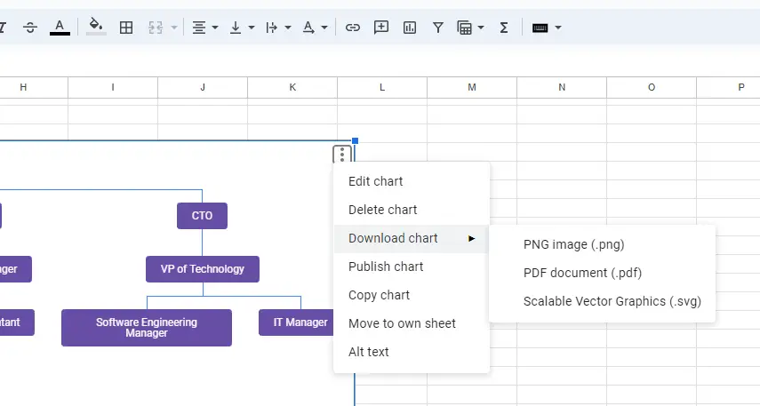
The chart is useless if you can use it anywhere you want other than in the Google Sheets. The Google Sheets allow you to download the chart in .png, .pdf or .svg.

Publish the chart to the web
Publishing your Organizational Chart to the web is a useful feature if you want to share it widely. This allows the chart to be visible to anyone with access to the link. You can either share a direct link to the web page created with your chart or embed the chart into your blog or website.
To publish the chart;
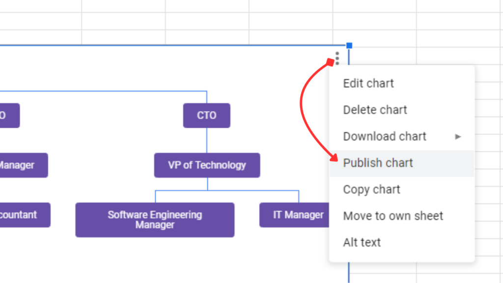
- Click on the three-dot icon in the top right corner of the chart.
- Select Publish chart.
- In the “Publish to the web” dialog, select whether to share an interactive chart or just an image from the dropdown. You can do this for both the Link and Embed options if you want to use both.
- Click Publish. Click Ok if you get a warning message.
- Copy and paste the link to see the dedicated web page for your chart, or embed the chart in your blog or website using the embed code.

Wrapping up
Creating organizational charts with Google Sheets offers a powerful, user-friendly, and cost-effective solution for visualizing your company’s structure. By leveraging Google Sheets’ built-in features and customization options, you can easily build, update, and share detailed organizational charts. Whether you need to add tooltips, update employee information, or publish your chart to the web, Google Sheets provides the flexibility and functionality you need to keep your organizational charts accurate and accessible. Start exploring these features today to enhance your team’s clarity and communication.

