When it comes to managing and analyzing data, Google Sheets is a reliable tool. However, to truly harness the insights within your data, you need visually engaging and interactive charts. That’s where the combination of Google Apps Script and Google Charts comes in. In this blog post, we will explore the benefits of visualizing Google Sheets data through web apps and provide a step-by-step guide with relevant code examples.
In previous posts, we discussed creating web apps to display Google Sheets data on HTML pages. You can make use of the method discussed in this post to include charts in those web apps. You can read those posts from the following links
- How to pull data from Google Sheets to HTML table
- How to Create an Online Data Entry Form that can Perform CRUD Operations on Google Sheets
- How to create a web form to get data from Google Sheets
Table of Contents
Benefits of Visualizing Google Sheets Data with Web Apps
While Google Sheets charts provide basic charting capabilities, HTML charts offer several advantages that may not be available in Google Sheets charts:
- Customization Options: HTML charts provide extensive customization capabilities, allowing you to have more control over the appearance and styling of your charts. You can customize colors, fonts, labels, tooltips, and other visual elements to match your brand or specific requirements.
- Interactive and Dynamic Features: HTML charts enable interactivity, such as hover effects, click events, zooming, and filtering. Users can interact with the chart elements to explore the data in more detail, enhancing the user experience and facilitating data analysis.
- Richer Chart Types: While Google Sheets offers a variety of chart types, HTML charting libraries often provide a broader range of chart types and advanced visualizations. You can create heatmaps, treemaps, radial charts, network graphs, and other specialized chart types to represent complex data patterns better.
- Real-Time Updates: HTML charts can be updated in real-time by fetching data dynamically from external sources, including Google Sheets. This allows for live data updates and real-time visualization, ensuring the charts always reflect the latest information.
- Advanced Data Manipulation: HTML charting libraries often offer more advanced data manipulation capabilities. You can perform data aggregation, filtering, sorting, and calculations directly within the chart code or through integration with JavaScript frameworks or libraries, enabling more sophisticated data transformations.
- Integration Possibilities: HTML charts can be easily integrated with other web technologies and APIs. You can combine chart visualizations with dynamic data from external APIs, incorporate user inputs, or integrate with other web applications, providing a seamless and connected user experience.
- Responsive and Mobile-Friendly: HTML charts can be designed to be responsive, adapting to different screen sizes and devices. This ensures that the charts remain visually appealing and readable on desktops, laptops, tablets, and mobile devices.
- Cross-Browser Compatibility: HTML charts are designed to be compatible with various web browsers, ensuring consistent rendering and functionality across different platforms.
- Ease of use: Google Apps Script and HTML charts are relatively easy to use, even for beginners. There are plenty of tutorials and documentation available online to help you get started.
- Cost: Google Apps Script and HTML Charts are free to use.
Using Google Charts with Google Apps Script to Display Google Sheets Data
Google Charts provides a good way to visualize data on web browsers. You can use the Google Apps Script HTML service to bring Google Sheets data to HTML pages, as we have done in several previous Web App examples. Then, you can use the Google Charts JavaScript library to display this data in charts as you prefer.
Google Charts offers a wide variety of chart types, including area charts, bar charts, bubble charts, column charts, combo charts, Gantt charts, geo charts, histograms, line charts, maps, org charts, pie charts, Sankey diagrams, scatter charts, stepped area charts, table charts, timeline charts, tree maps, and waterfall charts.
Why is Google Charts better than charts in Google Sheets itself?
Google Charts and Google Sheets charts are both great tools for visualizing data. However, there are some key differences between the two that may make Google Charts a better choice for some users.
Google Charts offers a wider variety of chart types than Google Sheets. This means that you can find a chart type that is perfectly suited to your data and your needs. Google Sheets, on the other hand, is limited to a few basic chart types.
Google Charts also offers more customization options than Google Sheets. This means that you can make your charts look exactly the way you want them to. Google Sheets, on the other hand, offers limited customization options.
In addition, Google Charts are interactive. This means that users can interact with the charts to get more information about the data. For example, users can click on individual data points to get more information about them.
Are Google Charts better than Looker Studio?
Google Charts and Looker Studio are both great tools for visualizing data. However, there are some key differences between the two that may make one a better choice for you than the other.
Google Charts is a free and easy-to-use tool that allows you to create basic charts and graphs. It is a good choice for users who need a quick and easy way to visualize their data. However, Google Charts is limited in its customization options and interactivity.
Looker Studio is a more powerful and customizable tool that allows you to create complex and interactive dashboards. It is a good choice for users who need a more robust data visualization solution. However, Looker Studio requires more technical expertise to use.
Overall, Google Charts is a better choice for users who need a free and easy-to-use data visualization tool. Looker Studio is a better choice for users who need a more powerful and customizable data visualization tool.
Building a Web App to Visualize Google Sheets Data
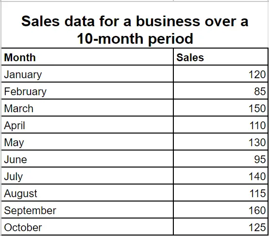
Let’s dive into the process of building a web app using Google Apps Script to visualize data from Google Sheets. We’ll illustrate this with an example that displays the following sales data in a line chart.

Step 01: Prepare the Google Sheet
In this example, I assume that you have a sheet named ‘Data’ in your Google Sheet. The Data sheet includes column data as shown in the image above. Make sure not to have any merged cells in your datasheet.
The first row should contain the column headers. If you do not include valid column headers, the script will not work correctly.
To follow this tutorial easily, you can make a copy of the Google Sheet provided below, which contains the data and the code.
Step 02: Set Up the Code
The Google Sheets above contain the code shown below. However, if you are starting with your own brand new Google Sheets, follow the steps below to create the web app. To do that, first, open the Apps Script editor by going to Extension > Apps Script in your Google Sheet. Then, rename the project.
- Replace the existing code with the code snippet in the Code.gs file below.
- Next, create a new HTML file by clicking the plus button next to the Files option and rename it as “Index”. Then, replace the existing code with the code snippet in the Index.html file below.”
Step 03: Deploy the web app
After you have set up the Code.gs file and Index.html file as explained above, you are ready to deploy the web app.
To do that, follow these steps:
- Go to deploy (The blue button at the top right) and click “New deployment“.
- In the New deployment window, click the gear icon and select “Web app“.
- Type a description for this deployment in the Description text box (optional).
- Under the Web App, Execute as option, select “Me (Your Email)”.
- For the “Who has access” option, select “Anyone” to enable everyone who has the link to see the web app. You can change this according to your requirements.
- Click “Deploy“.
- If this is your first time running the web app, it will require your authorization to run the code in your Google Account. If prompted, click the “Authorize access” button.
- In the next window, click on your email address.
- Then click the “Advanced” link.
- Click the link with the name of your Google Apps Script code.
- Click “Allow“.
- Finally, click on the web app URL to load it.”
Now you can see that your chart has been successfully created. Hover over the chart and legend to learn how you can interact with them.
How does this code work?
- When a user visited the URL you generated above, the
doGet()function in the Code.gs file is triggered. It returns the HTML output from the ‘index’ file. - In the HTML file, the Google Charts library is loaded by including the script source URL:
<script src="https://www.gstatic.com/charts/loader.js"></script>. This makes the necessary charting functionalities available. - The
google.charts.load('current', {'packages':['corechart']});is used to load the Google Charts library. - The
google.charts.setOnLoadCallback(drawChart);function sets the callback function drawChart() to be executed when the Google Charts library has finished loading. - The
drawChart()function invoked once the Google Charts library is loaded. Inside thedrawChart()function, thegoogle.script.runmethod is used to call thegetChartData()function defined in the Code.gs file. ThewithSuccessHandler()method specifies the callback function,displayChart(), that will handle the retrieved data. - The
displayChart()function receives the retrieved data as a parameter. It converts the data to a Google Visualization DataTable using thegoogle.visualization.arrayToDataTable()method. - Chart options, such as the chart title and additional chart settings, can be customized within the
optionsobject. - The
google.visualization.PieChartclass is used to instantiate a new line chart, passing the HTML element with the ID ‘pie_chart‘ as the container for the chart. - Finally, the
chart.draw()method is called to render the chart using the chart data and options.
Extend the web app to include multiple charts and create a stunning dashboard.
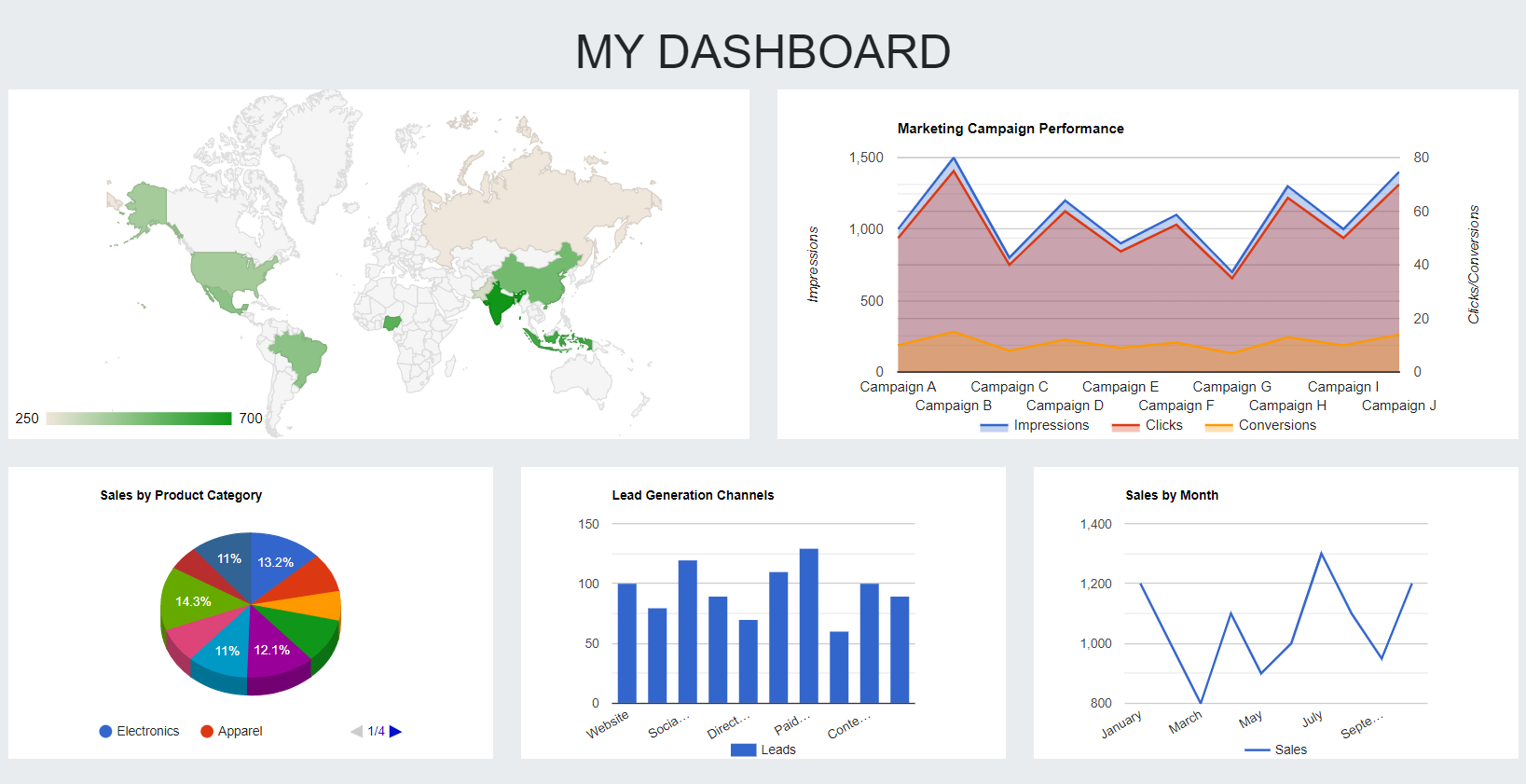
You can extend the example discussed above to include multiple charts and tables to create a stunning dashboard for your data stored in Google Sheets. You can use the Bootstrap framework to organize your charts on the page and make it responsive.
The following image shows an HTML dashboard created with Google Charts to visualize Google Sheets data. You can see the live version of this dashboard from this link. And also I have embedded this web app below in this post.

Use the Bootstrap framework to enhance the visual appearance of the web app
Bootstrap is a popular front-end framework that provides a set of CSS and JavaScript components for building responsive and attractive web pages. You can use Bootstrap to enhance the visual appearance of your user interfaces.
Bootstrap framework that helps create responsive web pages. Responsive pages adapt to the size of the device they are being viewed on, ensuring your dashboard looks good on any screen. To experience the effectiveness of this approach in visualizing Google Sheets data, you can try out the provided live web app URL. It will demonstrate the impressive results you can achieve in presenting and analyzing Google Sheets data using this method.
Stay up-to-date with our latest content and never miss a post – subscribe to our blog and get the latest articles delivered straight to your inbox!
Include multiple charts
To build a dashboard, you have two options for including multiple charts. Firstly, you can utilize various chart types to represent different aspects of the same dataset. Secondly, you can incorporate multiple charts that correspond to distinct datasets.
You can get the relevant code samples for each chart type from this Google Guide on Google Charts. You can make a copy of the Google Sheets which contain the sample data and the code for this web app with multiple charts from the following link. You can also view the code in this GitHub link.
Embedding your dashboard on websites
You can visualize Google Sheets data on your website by embedding the web app as below. To learn more about embedding web apps on websites, visit the link below.
How to Embed Google Apps Script Web Apps in Websites
Real-World Use Cases
Google Charts and Google Sheets are cost-effective and easy-to-use solution for creating dashboards. They are free to use and do not require any special skills or training. This makes them a great option for businesses of all sizes, especially those that are on a budget. Other dashboard solutions can be very expensive, but Google Charts and Google Sheets offer the same functionality at a fraction of the cost. This makes them a great option for businesses that are looking to save money and improve their decision-making.
Sales tracking: A sales team can use a dashboard to track sales data, such as total sales, number of leads, and average sales per lead. This information can be used to identify trends, set goals, and track progress toward those goals.
Marketing analytics: A marketing team can use a dashboard to track marketing data, such as website traffic, social media engagement, and email open rates. This information can be used to measure the effectiveness of marketing campaigns and make adjustments as needed.
Customer support: A customer support team can use a dashboard to track customer support data, such as number of tickets, average response time, and customer satisfaction scores. This information can be used to identify areas where customer support can be improved.
Project management: A project manager can use a dashboard to track project data, such as tasks, deadlines, and budget. This information can be used to ensure that projects are on track and within budget.
Human resources: A human resources team can use a dashboard to track employee data, such as salaries, benefits, and performance reviews. This information can be used to make decisions about compensation, benefits, and training.
These are just a few examples of the many ways that Google Charts and Google Sheets can be used to create powerful and informative dashboards. By visualizing data in this way, businesses can gain insights that they might not otherwise be able to see. This information can then be used to make better decisions, improve efficiency, and boost profits.
Wrapping Up
Google Sheets is a powerful tool for managing and analyzing data, but to truly unlock its potential, visualizing the data through web apps using Google Apps Script and Google Charts is the way to go. This combination offers numerous benefits such as extensive customization options, interactivity, advanced chart types, real-time updates, and seamless integration possibilities. It’s not only easy to use but also cost-effective, making it suitable for businesses of all sizes. Compared to other tools like Looker Studio, Google Charts stands out with its simplicity and user-friendly interface.
This post explains how you can build web apps to visualize Google Sheets data using Google Charts. The web apps are created with Google Apps Scripts. All these tools are free to use and this post included working web app samples for you to give a head start. And it provides a necessary explanation of the code to make it easy to understand. Further, this post explains how you can extend the web app using the Bootstrap Framework to include multiple Google Charts to create stunning responsive dashboards for your data.


Hi. How can i make a dashboard colecting data from diferent sheets? or diferente google sheet files? Thank you